Responsive Web Site
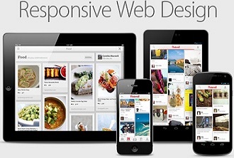
Responsive web design (RWD) is an approach to web design aimed at crafting sites to provide
an optimal viewing experience—easy reading and navigation with a minimum of resizing, panning,
and scrolling—across a wide range of devices (from desktop computer monitors to mobile phones).
Responsive Design is not the same as mobile design. Mobile design entails creating an entirely new
website or web app with content specifically created for the mobile experience. Responsive Design,
on the other hand, means that the same domain, the same content, and the same syntax — more or less
manipulated by JavaScript and/or CSS3 Media Queries — respond to different viewports to provide the
best user experience possible for each device. The different viewports include desktop monitors, laptops
, tablets, and mobile devices and their corresponding orientations.
Responsive Design, as the underlying
base of a websites’ deployment, uses flexible or fluid grids, fluid images, and CSS3 Media Queries
to adapt to the viewers’ different device widths and resolutions. Developing Responsive Design is
rarely a process with an ending, but rather it’s an ongoing effort to optimize the user experience
on different viewpoints. As more and more different devices with access to the web enter the market,
it is essential that a website can fluidly adapt to multiple screen sizes. Web developers and
designers have to go through a shift in thinking about how to cater the design to different viewports.
A website needs to look good but, most importantly, it needs to be equally usable on a smartphone,
tablet, e-reader, and desktop or laptop.